Top photography tips for graphic designers
Along the career paths of graphic designers, even though they can't believe it, they will also ask for photography to be applied. Therefore, it is extremely important that you know how to use a photographic equipment or at least have basic knowledge, such as the principles and main elements of photography. In this article we will give you some of the main photography tips for graphic designers.
Photography applied in graphic design
When we talk about photography and graphic design, we could decide that at some point in time we tend to have a relationship. In reality, if we see it from an artistic point of view, it is the relationship where a story is told through a photograph from that specific point of view. Currently, this method of photographic expression generates cognitive emotions according to different types of image composition. Photography applied to graphic design is the composition that is carried out with the help of digital elements to compose a scene and transmit a message, even being able to improve them using editing programs such as Photoshop or Illustrator.

Photography elements for graphic designers
It is obvious that designers will not tend to take very elaborate photographs while composing them, as much as professional photographers, but as we mentioned before, they must know the basic concepts. There are five elements of photography that every designer must have in mind and be able to use a variety of styles to create surprising photographs.

List of photography elements for graphic designers:
Color: if you are looking for color, make sure the colors complement each other. If you don't do it, change the clothes, the scenery, etc., until you do it. Painters do not choose random colors for their paintings. Why should photographers allow external forces to dictate color choices?
Form: it is the structure of the shapes that make up the photo. It gives a third dimension to the photo. The shape is constructed through the use of lights and shadows and makes a photo jump off the page.
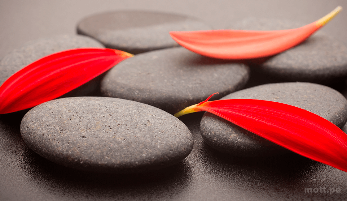
Texture: the photographs are two-dimensional, which makes the sensation of texture difficult. The best way to play it is to use strong shapes, composition and angles of light that complement the textures of the scene.
Model or patrón: this is the use of repeated elements in a photograph, thus creating a patrón.
Line: this is the way a person looks at a photograph. It's like the eye of a person looking at a photograph.
Principles of photography in graphic design
Just like the elements in photography and graphic design, there are principles that you must follow to have a good shot. It is necessary to understand the principles of photography, using a basic concept to create images that impact your target audience.
Lighting: always pay attention to the light in your stage or if it is necessary to use a flash or internal flashlight. Apart from the camera configuration to obtain the correct lighting.
Theme: a strong guy is more than an attractive model. The surroundings, the clothes, the accessories, the pose and the emotional expression, all work together to tell a story. It's up to the photographer to make sure it's a story worth telling.
Focus: the focus is not just about what to focus on, it is also about how much depth of field to show in the portrait. The basic recommendation is to focus on your eyes.
Background: for funds, the general rule is to keep it simple. It is possible to take good environmental portraits, but it is very easy for the backgrounds to shock and distract from the focus of your image. The background and foreground images tend to merge into one photograph.
Composition: you must have the account of the frame and the stage where you take the photograph. A great portrait photographer considers shapes, lines, landmarks, angles, negative spaces, where to place the point of focus in the frame to obtain maximum impact, and so on.
Exposure: in the exhibition we must take into account the density of the colors and the brightest areas of the image. Try to remember that you can use color, texture and exposure to emphasize shapes in your compositions.

Conclusion
Solo photography is applied by professionals in this field, there are careers like graphic design in which at some point you will have to apply photography to show your creations, and you will at least have to have basic knowledge so that you can create a good composition.

- January 04, 2026
World War I and the Visual Arts

- January 04, 2026
Graphic Art: Much More Than an Image, a Brazilian Visual Language

- January 04, 2026
The Future of NFTs and AI-Generated Art

- January 04, 2026
Zé Otavio - Brazil

- January 04, 2026
Screwed

- January 04, 2026
A Comprehensive Guide to Beautiful Lettering

- January 04, 2026
Containing the Divine: Ancient Peruvian Pots

- January 02, 2026
Gallery of Illustration by Zé Otavio – Brazil

- January 01, 2026
Human Creativity vs. Algorithmic Creativity

- January 04, 2026
Graphic Art: Much More Than an Image, a…

- January 04, 2026
The Future of NFTs and AI-Generated Art

- January 01, 2026
Human Creativity vs. Algorithmic Creati…

- January 01, 2026
The Role of AI in the Preservation of C…

- December 31, 2025
Smart Museums: Artistic Experiences wit…

- December 31, 2025
Ethical Challenges of Machine-Created A…

- December 30, 2025
Generative Art: From Code to Gallery

- December 30, 2025
How Artificial Intelligence Is Redefini…

- December 29, 2025
Artificial Intelligence and the Reconfi…

- December 29, 2025
The Artificial Intelligence Revolution …

- December 28, 2025
The Difference Between Contemporary Art…

- December 28, 2025
The Impact of Contemporary Art on Today…

- December 28, 2025
Contemporary Art and its Multiple Langu…

- December 27, 2025
Graffiti: Urban Voices That Tell Stories

- December 27, 2025
The Art of Graffiti: Expression, Identi…

- December 24, 2025
Art as Human Expression and Universal L…

- December 24, 2025
Art in the Street: When the City Become…

- December 23, 2025
Urban Art in Latin America

- December 23, 2025
Folk Art in Indigenous Communities of L…

- December 22, 2025
Graffiti as a Social and Political Lang…

- August 29, 2023
The history of Bolivian art

- February 19, 2024
Analysis and meaning of Van Gogh's Star…

- January 28, 2024
Culture and Art in Argentina

- September 25, 2023
What is the importance of art in human …

- September 23, 2023
What is paint?

- August 23, 2023
The 11 types of art and their meanings

- August 10, 2023
14 questions and answers about the art …

- September 23, 2023
Painting characteristics

- August 30, 2023
First artistic manifestations

- January 12, 2024
10 most beautiful statues and sculpture…

- September 23, 2023
History of painting

- March 26, 2024
The importance of technology in art1

- July 13, 2024
The impact of artificial intelligence o…

- March 26, 2024
Cultural identity and its impact on art…

- April 07, 2024
Graffiti in Latin American culture

- August 16, 2023
The 15 greatest painters in art history

- April 06, 2024
History of visual arts in Ecuador

- April 02, 2024
History visual arts in Brazil

- October 18, 2023
History of sculpture

- November 21, 2024
The Role of Visual Arts in Society

- February 19, 2024
Analysis and meaning of Van Gogh's Star…

- August 13, 2023
9 Latino painters and their great contr…

- August 23, 2023
The 11 types of art and their meanings

- August 10, 2023
14 questions and answers about the art …

- August 27, 2023
15 main works of Van Gogh

- August 29, 2023
The history of Bolivian art

- January 28, 2024
Culture and Art in Argentina

- November 06, 2023
5 Latin American artists and their works

- September 23, 2023
Painting characteristics

- September 23, 2023
What is paint?

- September 25, 2023
What is the importance of art in human …

- March 26, 2024
Cultural identity and its impact on art…

- August 30, 2023
First artistic manifestations

- December 18, 2023
10 iconic works by Oscar Niemeyer, geni…

- January 20, 2024
What is the relationship between art an…

- January 12, 2024
10 most beautiful statues and sculpture…

- August 24, 2023
The most famous image of Ernesto "Che" …

- October 30, 2023
Characteristics of Contemporary Art

- May 26, 2024
Técnicas de artes visuais

- August 22, 2023


